Monday, June 14, 2010

Baba and Nyonya, the combination of many cultures

The whole mm085 had went to Malacca for a research.
It is really exciting as we going to spend our day at the street that full with history and a lot of fresh things, the Jonker Street.
A sunny day, we start our trip at 730am.

Once we reached, straight a way, we head to our most important destination, the Baba and Nyonya Heritage Museum.


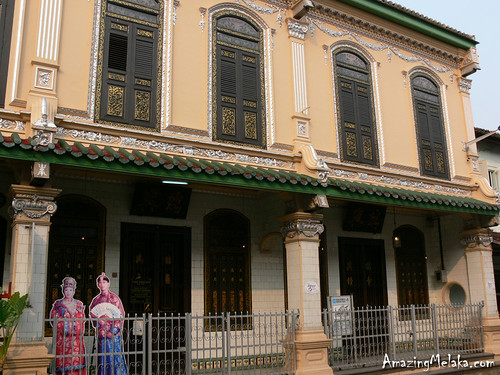
The museum was modified by combining 3 houses and located at Jalan Tun Tan Cheng Lock, I looked around, it should be a housing area of rich people at olden time. The house is big and i felt a bit of western style design on it.

Entrance fee for adult is rm8, and will guide by guide.

She explain the whole structure of the building, the design, the life style of the family and some history of baba and nyonya.

basicaly my opinion is she explain according to what she know about the family, this can't really satisfy we all, a furthermore research by ourself is very important.

We had try the food of baba nyonya at the restaurant at the same street., some of the meal I had tried before but i doesn't know it is baba nyonya meal.
I had found the kuih that I had been looking form long time ago at there, now i only know that the kuih is actually traditional kuih of baba nyonya.

The culture of baba nyonya is mix among the culture of chinese and malay. And it is very close to we all.

Well, that is just an intro =p


---------------------------------------------------------------------------------------

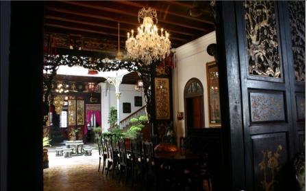
The whole research about baba nyonya, I really feel interesting about the structure of the house of Baba and Nyonya.


The house very long and wide, influenced by multiple culture.


Western influence can clearly be seen in the number of antique furnitures with Italian, British and Dutch influences. The western influence does not end here as there are many things in the museum…from the Victorian era lamp to floor tiles…have a story of their own to be told.


The interior design of the house is very chinese style, from the chair to the door, from the living room to kitchen. And the room is been seperated by chinese traditional carfting wall. Most of the furniture is made by very good quality of wood with chinese crafting.


STRUCTURE OF HOUSE

They have two living room to serve their guests, one is or friends and the other is for those that closer with them like relatives.

Female that haven't marry are not allow to go to the living room and chat together with guests, there is a big wooden wall blocking the living room and the inner living room. So those girl will peep from the hole on the wooden wall.


The stair that done without using nail is full with craft will close and lock at night, so that man that back at late night can't go to upstair. The master bedroom is at front of the second floor. They had a small hole that been cover. They can peep their visitor from there. If they not going to entertaint the guest, they can just pour water from there.


And there is a area inside the house had well and there is no roof on top of it.(天井, from baba house that I visited had this design, not only the museum.) The water paip that connect from the roof to the well area had also been design, the paip been cover by a decoration of fish, when raining, the water from roof will come out from the mouth of the fish. This design is done according to the chinese sentence, 如鱼得水 and also 肥水不留外人田

The kitchen is very simple, just like normal traditional chinese house that i saw before.

They also had a space for praying.

The washing room part in my opinion is more to malay style.

The whole house is combine with chinese, malay and also western.


So that is it~

Tuesday, January 19, 2010

web design 2

Project Definition

This project is to revamp the website of COMPUTERTOTS to suit to the current market and we’ve been given a 7 weeks to complete it.COMPUTERTOTS is under ECW Corporation with COMPUTER EXPLORERS. COMPUTER EXPLORERS is a computer education center for children from aged 3 to 12. This company expanded globally in 1994, and the program reaches thousands of children and schools worldwide. COMPUTERTOTS is the learning center that located in several places in Malaysia. My role is to enhance their marketing goal, to increase revenue, giving easy access information and also to keep customers/target audience loyal to this brand.


Current Site’s Analysis Goals

The purpose of this website is to give customers conformity of their service, user friendly way to get information of the programs that they provide and the benefits of the programs. This website is very important because this is an international company. Customers from other parts of the country would want to know more about COMPUTERTOTS, and their image which will highly affect the impression of the customer. Main improvement that needs to be done is the typo treatment and the information arrangement, maintenance of the website which include constant updates on all information, make the button more clearer and. There is no banners or stat counters. The design is neither not appealing nor attractive especially when comparing with the other competitors.


Client's Analysis

COMPUTERTOTS and COMPUTER EXPLORERS, was co-founded in 1983 by Karen Marshall (M.Ed., Ed.S.) and Mary Rogers (M.A., Ed-now retired). This company was franchised in 1989, expanded globally in 1994, and the program reaches thousands of children and schools worldwide. As educators and mothers of young children, they shared the vision that computers would play an indispensable role in the education of children. COMPUTERTOTS provide services to teach children how to use the computer as a tool for communication, productivity and learning and provide children with a creative, discovery-oriented computer experience. COMPUTERTOTS unique selling point is they offer a variety of programs which suitable for children from aged 3 to 12 and above, and challenge students to be innovative technology users. The classes are also offered in many places of Malaysia and even internationally.


Long-term Site Goals

A quality website will help a lot on making the customers have confidence with the company. With clear informations, customers will feel convenient and build confidence to the company as they understand what is the service they can find from the company. Subscription of monthly newspaper will let the customer keep in touch with the updates of company. To make this site more useful, more information will be provided such as pricing and location map. Adding advertisement will increase their side revenue and maintenance will improve loyalty to this companny.


Short-term Site Goals

For the short term goal. I propose to Keep updating the news, new programs and new activity they going to have on the website. Providing RSS will help custumer keep in touch with the site, and it also can help to attract more customer by giving discount on certain time, email them using newsletter to inform the latest promotion or invitation on events.

Target Audience

Target audience would be parents that concern about the education of children, educators can find for job or business partner can look for the information provide at franchise and career opportunities information. While the students can research from the website and get the information they want. The information and contents should be clear and neat as build the confidence of target audience. To maintain this website, information on latest news, or promotion should be updated regularly to keep audiences coming back. Make the site better with movement by adding new design elements such as flash intro.


Competitor's Analysis

From the client’s competitor analysis, most of the primary competitor's website lack of design and do not have any relevant design that suit to their website and services. And, if compare to other education websites such as Da Vinci Kid, their information management is better and the appearance of the website is much more neat and nice even though that is different approach.

Tuesday, January 12, 2010

references

web design 2- competitior website


this is the website of a earlier kids education center
the color they used is soft and consistency
and the information is not that many words

-------------------------------------------------------------------------------------


this is a website of art academy for kids and adult
the design is fresh and the color is match
the sistem and grid of the web is clean and clear

web design 2

customer website
a website of computer education center for kids


i found that the problem of website is the color they use is doesn't consistency
color they used are very bright, pop up
design not that interesting
nevigation bar are too long and the words are too small

Tuesday, October 20, 2009

top